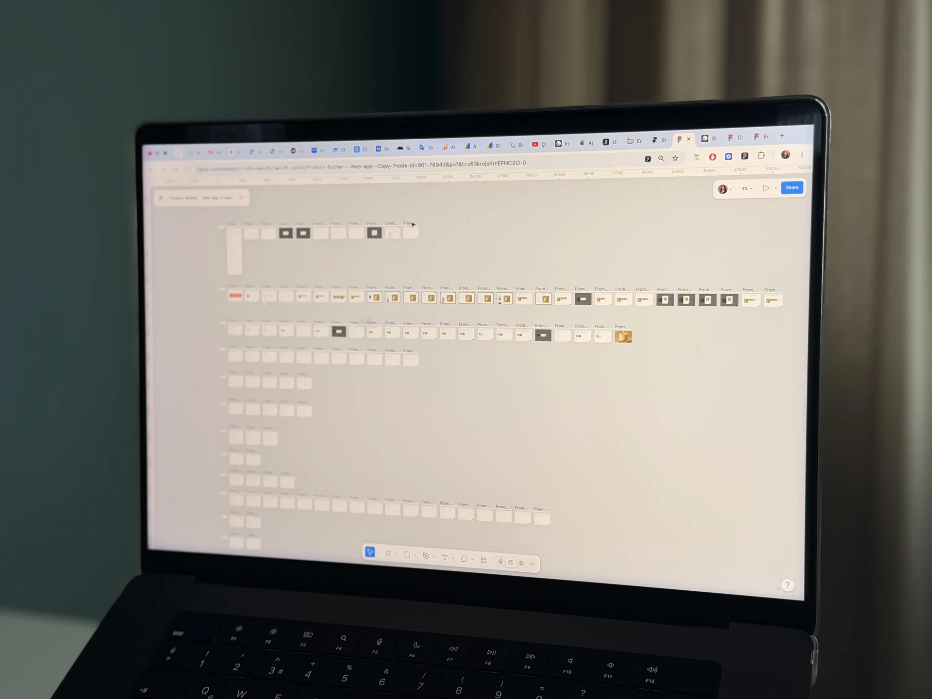
Take a typical case: a CTO asks me to look at a Figma file the team received from a previous designer, because a 12 screen feature has produced 61 questions in the engineering channel. I open the file and count what is missing rather than what is there. 12 screens, 0 empty states, 0 error messages, 1 width, 9 unnamed greys and no note on what happens when the form is submitted twice. The 61 questions are not the engineers being difficult. They are the design, finished in Slack.
This is why I keep a design deliverables checklist for developers and run every screen through it before I call the file dev ready. It has 30 points. Most of them take 5 minutes per screen. All of them are faster in Figma than in code review.
This post covers what dev ready design means, the full 30 point checklist, the states every screen needs, responsive rules, copy, tokens and naming, what engineers ask for most, and how we run the checklist inside a project.
What does dev ready design mean
A screen is dev ready when a developer can build it without making a design decision. Not without asking any question, that never happens, but without inventing a state, a breakpoint, a message or a colour because the file does not say.
That definition is useful because it is testable. Take any screen in the file and ask: what does it look like with no data, while loading, when the request fails, on a phone, with a 60 character name, for a user without permission. If the answer to any of those is "the developer will figure it out", the screen is not dev ready. It is a picture of the happy path.
Our full handoff process, including the walkthrough and design QA, is in Design Handoff to Developers. This post is the checklist that decides whether the file is ready for that handoff at all.
The 30 point design deliverables checklist for developers
This is the list we run per screen and per feature. Copy it into your own tracker and tick it before you send a file to engineering.
States, per screen
- Empty state at signup, with a next action and copy.
- Empty state after a filter or search returns nothing, with a way to clear it.
- Loading state: skeleton, spinner or optimistic, and for how long before a message appears.
- Partial state: what renders when 1 of 3 requests fails.
- Success state: what confirms the action, for how long, and where focus goes.
- Field level error: the message, next to which field, in what wording.
- Screen level error: what stays usable while the error is shown.
- No permission state: what this role sees and who they contact.
- Minimum data: 1 row, 1 character, 1 word.
- Maximum data: 10,000 rows, 90 character names, 12 tags on 1 item.
- Offline or slow connection: what is cached, what is blocked, what retries.
Responsive rules, per screen
12. At least 3 widths drawn, usually 1440, 1024 and 390 pixels.
13. A written rule for what happens between the widths: what stacks, what hides, what scrolls.
14. Keyboard open state on the smallest width for every screen with an input.
15. Touch targets of 44 by 44 pixels or more on the smallest width.
16. Truncation rules for every text that can be long: ellipsis, wrap or tooltip.
Copy, per screen
17. Every label, button text and helper text written in the frame, not as placeholder.
18. Every error string written, including the network error.
19. Every empty state text written, with the action.
20. Character limits stated for every input and every editable field.
Tokens and naming, per file
21. Colours, spacing, radius and type as named variables, not hex values.
22. Semantic names such as surface.raised and text.muted, not grey100.
23. 1 spacing scale, 4 or 8 based, with no value off scale.
24. Token names agreed with the engineering lead and matching what exists in code.
25. Components named as they are used, Table row / selected / compact, not Frame 214.
Behaviour, per feature
26. A flow map with entry points, decisions, exits and what happens on failure.
27. Validation rules per field: required, format, when it runs, what blocks submission.
28. What happens on a double submit, a session expiry mid flow, and a browser back.
29. Sort order, default filter and what is remembered between sessions.
30. What is optimistic and what waits for the server, with the rollback state drawn.
A 12 screen feature that passes all 30 points is usually 40 to 60 frames plus 3 to 4 pages of written rules. That sounds like a lot. It is less than 61 questions.
Responsive rules are rules, not frames
3 frames at 3 widths is the minimum, not the deliverable. The deliverable is the rule that covers the 1,050 pixels in between.
We write the rule next to the frames in 2 or 3 lines.
For a data table: columns 5 to 8 collapse into a row detail below 1024, the table becomes cards below 640, filters move into a sheet below 768. For a form: 2 columns above 1024, 1 column below, the primary button pins above the keyboard on mobile.
A developer reads that and builds it once. Without it, 3 developers build it 3 ways.
The keyboard open state is the 1 responsive frame that almost every file misses. On a 390 wide screen the keyboard takes about 45 percent of the height. If the primary button is at the bottom, it is now behind the keyboard. Draw that frame for every screen with an input. It takes 2 minutes and it prevents the most common mobile bug I see in design QA.
Copy, tokens and naming
Copy is design. If the empty state says "No items", the developer ships "No items". If the file says "You have no projects yet. Create a project to start tracking time." the developer ships that. The 2nd version took 1 minute in Figma and it is the difference between a blank screen and an onboarding step.
So every string is written in the frame, in the final wording, including the ones nobody wants to write: the network error, the permission error, the validation message for an invalid date. If your team has a product voice owner, they review the strings in Figma, not in the built product.
Tokens are the same argument for colour and spacing. A file with 9 greys as hex values produces 9 developer decisions per screen. A file with border.default, text.muted and surface.raised produces 0, and the dark theme is a token swap instead of a redesign. We agree the names with the engineering lead before the file is finished, and we use whatever already exists in the code rather than a parallel vocabulary.
What engineers ask for most
In most handoffs I see, the same 6 questions come up in the engineering channel on almost every feature, in this order.
What happens when this fails. What does this look like with no data. What is this colour called. What happens at 1024. Is this button the same component as the 1 on settings. What is the error message.
All 6 are on the checklist. That is not a coincidence. The checklist is those questions, turned around. When a file passes it, the questions that remain are the interesting ones: a real trade off, an API constraint nobody knew, a case the product owner has to decide. Those are worth a conversation. In the typical case above, the other 55 are not.
Mistakes I see in design handoff
The happy path only
12 screens, 12 states, 0 problems drawn. The other 40 frames get designed by the developer at 5pm and filed as bugs by the designer 3 weeks later.
Designing with fake data
Real data has 47 character names, negative values, missing days and 1 customer with 400 times more rows than everyone else. All of it changes the layout.
Placeholder copy
"Lorem ipsum" and "Button" ship as "Lorem ipsum" and "Button" more often than anyone admits.
Literal token namesgrey300 is a colour. border.default is a decision. Only 1 of them survives a dark theme.
1 width
A 1440 pixel frame and a note that says "make it responsive". That note is 20 decisions handed to 3 developers.
Rules in a separate document
A 14 page PDF nobody opens after day 2. Rules live next to the frames or they do not exist.
Detached instances
A component edited in place on 1 screen, so the file says it is a button and the code says it is not.
Where AI tools help and where they do not
AI tools help with the volume on this checklist. Generating the long tail of state variations from 1 correct component, drafting the 30 error strings we then edit, filling a table with realistic data at minimum and maximum, and producing code scaffolding from a finished frame. On a 12 screen feature this saves us about 1 day.
Where they do not help is the decisions the checklist exists to force. What happens on a double submit is a product decision. Which columns collapse before the others is a priority decision. What the permission error says depends on who the user should contact. A model will give a plausible answer to all 30 points in seconds, and 12 of the answers will contradict each other across screens. The checklist is not a form to fill in. It is 30 places where someone has to decide.
FAQ
What does dev ready design mean?
A design is dev ready when a developer can build it without making a design decision. Every state is drawn, every width has a rule, every string is written, every colour and spacing is a named token, and the behaviour on failure is decided. The test is simple: pick a screen and ask what it looks like with no data, while loading and on a phone.
What should a design deliverables checklist for developers include?
5 groups: states per screen, responsive rules per screen, copy per screen, tokens and naming per file, and behaviour per feature. Our version has 30 points, listed above, and the states group alone has 11 because it is where most files fail.
What UI states does every screen need?
Empty at signup, empty after filtering, loading, partial, success, field error, screen error, no permission, minimum data, maximum data and offline. Not every screen needs all 11 drawn, but every screen needs the decision written down, even if it is "not applicable".
How many frames should a dev ready Figma file have per screen?
Between 3 and 6 on average. A simple settings screen might be 3 widths and 1 error state. A data table with filters is often 8 to 10 frames once empty, loading, maximum data and the keyboard state are drawn at 3 widths.
Who writes the interface copy, the designer or the developer?
The designer, in the frame, in final wording, and a product voice owner reviews it in Figma if there is 1. If the developer writes it, it is written at 5pm on the day before release, and it reads like it.
Is this checklist different for mobile apps and websites?
The 30 points hold. Mobile adds permission prompts, safe areas, dark mode and 3 device sizes, which we cover in Mobile App UI Design Services. Websites add CMS content limits, 4 widths and page speed rules, covered in Custom Website Design for Startups.
Working with us
We design interfaces for teams that have to build them, so every screen we deliver passes the 30 points above before handoff. On a 15 to 25 screen product that takes 3 to 6 weeks, with the 3 hardest screens in 5 business days, tokens agreed with your engineering lead in week 1, and design QA on staging after the build.
If your engineering channel has more than 30 design questions per feature, book a free 15 minute intro call and send us the Figma file before it. We will run the 30 points on 3 screens and tell you what is missing.